: : : sucre parfait campaign /// 2014 : : :
for a golden moment
The brief
Sucre Parfait is the new premium label by Sukkar Al Usra, a well-established sugar brand in North Africa.
This new sub-brand was designed to embody elegance, taste, and a hint of French sophistication – a true standout on supermarket shelves.
The challenge:
Create an entirely new brand from scratch – from naming to 360° campaign – that communicates premium quality and transforms everyday sweetness into something truly special.
The idea
"For a Golden Moment"
Sugar isn’t just sweet – it’s the beginning of a moment:
A tea shared with guests.
A dessert made with love.
A cocktail that closes the evening.
Sucre Parfait turns ordinary rituals into elegant occasions – and the golden glow of that idea shaped everything from brand design to visual storytelling.
The Execution
As Creative Lead, I built the brand world from the ground up:
- Logo Design
An elegant golden monogram "P", sculpted in 3D – refined, timeless, and sophisticated.
Its form borrowed from French patisserie aesthetics – soft curves, graceful lines, and a touch of flourish.
Packaging Design
The packaging was created to shine – quite literally.
– Gold shimmer finishes for a sense of indulgence
– A refined tea glass as a symbol of hospitality and taste
– A white background to convey purity and quality
– A subtle gold gradient to enhance the premium appeal
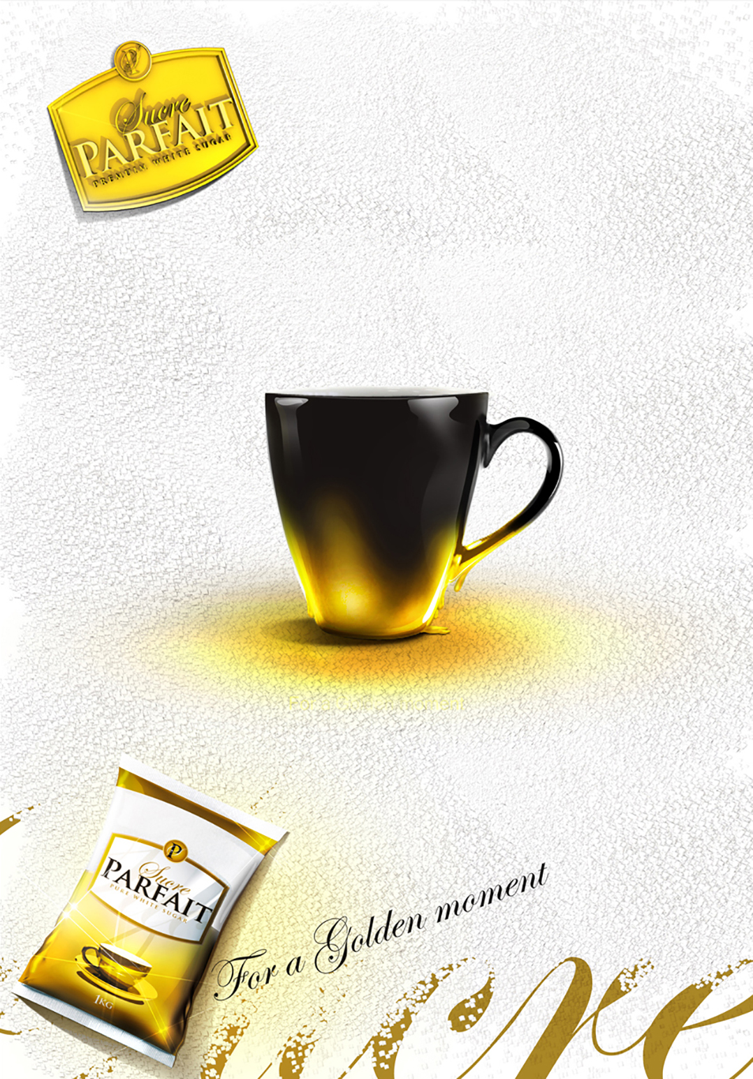
- Campaign Visuals
Every visual was crafted to reflect a "golden moment":
– A drink in a glass with a golden stem
– A tea cup casting a golden shadow
– A spoonful of sugar staged like a luxury item
- The overall look:
Clean. Radiant. Luxurious.
Almost like a perfume ad – minimalistic, yet iconic.
360° Rollout
The campaign was brought to life across all key channels:
– POS materials: Wobblers, danglers, shelf cards
– Out-of-home: Billboards and citylights in high-traffic urban areas
– Digital & social media visuals
– Print and packaging visuals embedded within brand content
The entire visual language was kept light, bright, and premium – with generous white space, golden accents, and elegant typography.
The result
Sucre Parfait launched as a true icon in the sugar aisle – a brand that felt as refined as it tasted.
The line “For a Golden Moment” became the brand’s emotional anchor – redefining how people talk about and experience sugar.
✨ An everyday product.
💫 A brand with presence.
🌟 A design that doesn’t just sit on the shelf – it shines.
Client: Sucre Parfait
Agency: Strategies BBDO - Cairo
Logo Design: Ahmed Ghandour
Packaging Design: Ahmed Ghandour
Concept & Art Direction: Ahmed Ghandour
Copywriter: Ahmed Ghandour